What is the living environment? It’s a whimsical way of describing the complex relationships formed when living entities inhabit a world with other non-living entities. These complex relationships can be overwhelming. Crickets eat grass, frogs eat crickets, but so do some birds, snakes eat frogs, but they also eat mice, and so on. At the same time, organisms (living entities) move from place to place, and reproduce, giving rise to more organisms, as part of their “life cycles”. They also interact with the atmosphere and soil, for instance algae in the ocean produce oxygen. So we have life cycles, diets, food chains, the ocean, and the parts of the organisms (their organs, like their stomachs, brains, and so on) forming complex interlocking systems.
The complexity of such interdependent systems can seem overwhelming. However rest assured, the interactions in these systems can be predicted and understood using a few simple principles.
This is the domain of “science”, understanding the natural world by uncovering simple rules that are all around us. Hidden patterns that let us predict the future, build cities, tame disease, and understand the beautiful harmony of our living world. “Gaia” is another term for this living environment we explore in this course, and is where this guidebook gets its name.
1.1 What is Science?
For our purposes, when you develop a “science” of a certain topic, all you are doing is developing a collection of accurate “models” of situations that fit into that topic. Suppose I take fashion for example. If I want to develop a “science” of fashion, I need to develop a collection of accurate “models” of situations in the fashion world.
For example, a fashion scientist might be interested in the question of how much people spend on clothing per year. You might have, for example, people’s annual income in the United States. You may want to predict from this annual income, what chunk of it is going to be spent on clothes that year. That is, how much does a random household in the United States spend on clothes?
To do this, you need to identify the :dependent variable in your model, the thing you are trying to predict. In our case it’s clothing spending.
You then need to identify the independent variable, the data you are using to predict the dependent variable. To do this you need to make an actual hypothesis, the idea you have about how to understand the independent variable, in this case clothing prices.
For example, one hypothesis you might have is that the clothes spending has to do with how much money you made that year. The more money a household has, you might say, the more will be spent on clothes. Seems logical.
Usually in science we like our hypotheses to be testable and specific. Instead of just saying “more money means more clothing spending”, we should be rigorous about our claim and say exactly how income and clothing expenses are related. For this we need to make some observations in the real world of the dependent and independent variables.
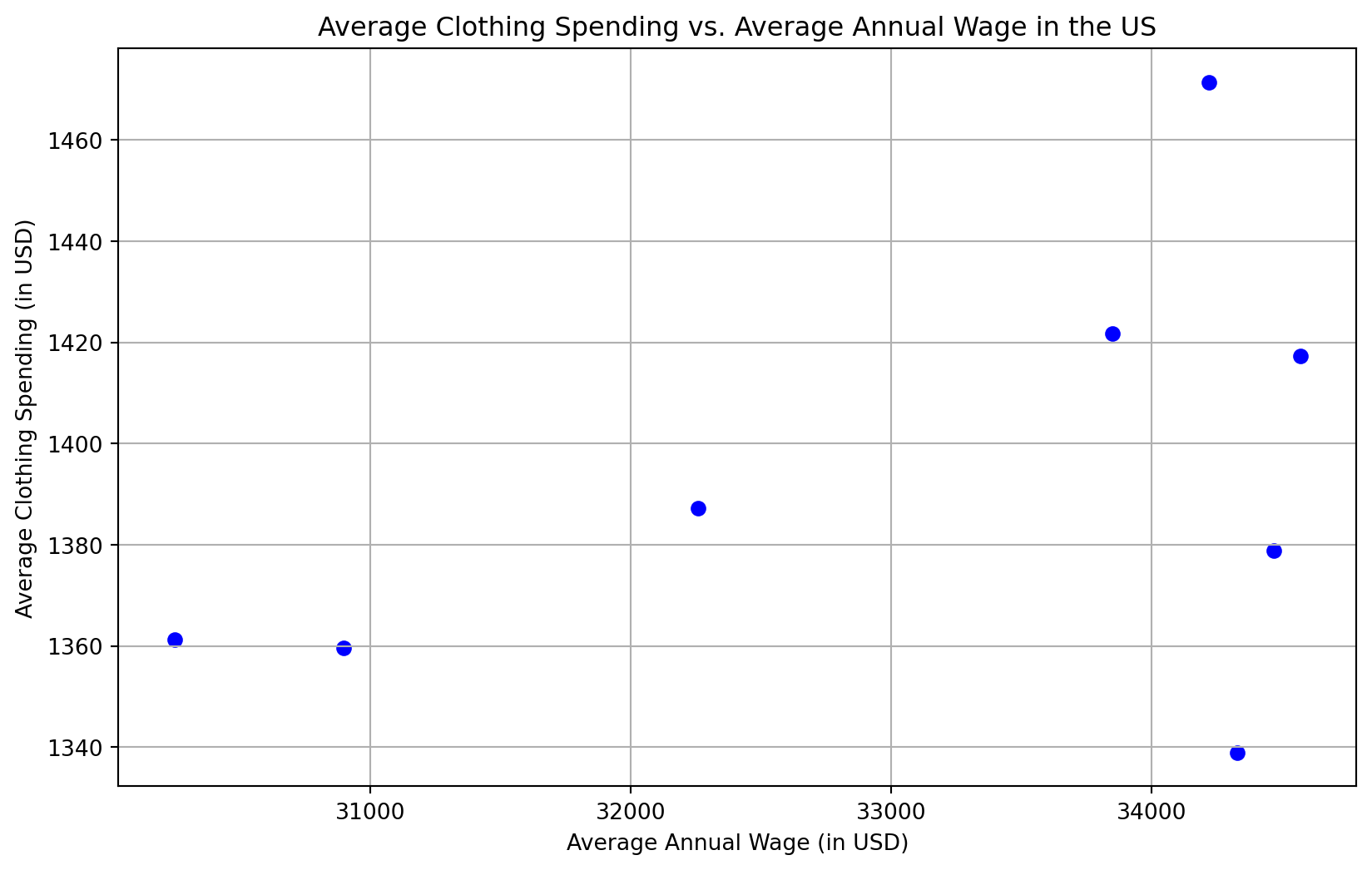
For example, if we’re looking year over year, or annually, at clothing spending and wages, each row here is an “observation” we can make about the dependent variable (Average Spending on Clothes) and the independent variable (Average Annual Wage) that year.
Year
Average Annual Wages That Year
Average Spending on Clothes
1995
$30250
$1361.25
1996
$30900
$1359.6
1997
$32260
$1387.18
1998
$33850
$1421.7
1999
$34220
$1471.46
2000
$34570
$1417.37
2001
$34470
$1378.8
2002
$34330
$1338.87
Here we might notice a pattern. The clothes spending always seems to be a little over $1000, and the wages always seem to be between $30000 to $35000. Interesting, so we might hypothesize more specifically that the clothes spending is always 1/30th of the annual wage for a household, or approximately 3%.
If we plot all our points, we get the below (you can click on the code label to see the python code you could use to make this plot yourself in something like Google Colab:
Code
import matplotlib.pyplot as plt# Data providedx_values = [30250, 30900, 32260, 33850, 34220, 34570, 34470, 34330]y_values = [1361.25, 1359.6, 1387.18, 1421.7, 1471.46, 1417.37, 1378.8, 1338.87]# Create the scatter plotplt.figure(figsize=(10, 6))plt.scatter(x_values, y_values, color='blue', marker='o')# Adding title and labelsplt.title('Average Clothing Spending vs. Average Annual Wage in the US')plt.xlabel('Average Annual Wage (in USD)')plt.ylabel('Average Clothing Spending (in USD)')# Show plot with gridplt.grid(True)plt.show()
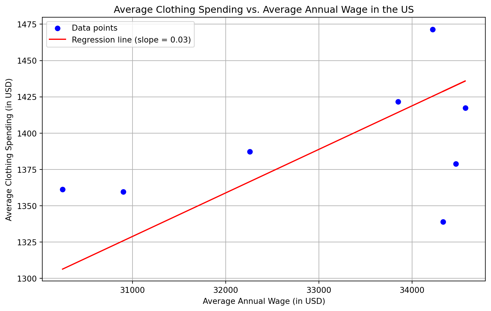
Our “model” can be thought of as a line through these data, of the form \(y = mx + b\) from algebra. Let’s actually show this “3% of income” hypothesis on the graph. It looks (predictably) like a line:
Code
import numpy as npimport matplotlib.pyplot as plt# Data providedx_values = np.array([30250, 30900, 32260, 33850, 34220, 34570, 34470, 34330])y_values = np.array([1361.25, 1359.6, 1387.18, 1421.7, 1471.46, 1417.37, 1378.8, 1338.87])# Given coefficient (slope) for the linear regression lineslope =0.03# Calculate the y-intercept for the best fity_intercept = np.mean(y_values) - slope * np.mean(x_values)# Create the regression lineregression_line = slope * x_values + y_intercept# Create the scatter plotplt.figure(figsize=(10, 6))plt.scatter(x_values, y_values, color='blue', marker='o', label='Data points')plt.plot(x_values, regression_line, color='red', label=f'Regression line (slope = {slope})')# Adding title and labelsplt.title('Average Clothing Spending vs. Average Annual Wage in the US')plt.xlabel('Average Annual Wage (in USD)')plt.ylabel('Average Clothing Spending (in USD)')# Show plot with grid and legendplt.grid(True)plt.legend()plt.show()
Our hypothesis holds up pretty well! It fits the data nicely, and a point on this line is only a few dollars off from true clothing spending for a given year. Our inference (a claim based on the evidence of the observations) that clothing spending is always 3% turns out to be a pretty reasonable one.
By the way, the table we used to make the graph where each row is an observation and each column is a variable is called a data table, whenever you graph the data table on a graph you should follow these rules on the Regents exam:
Both the x and y axis of the graph must be labeled or titled.
These labels are typically the same ones used in the data table. Once again units of measurement must be written with the title.
The independent variable is always plotted on the x-axis. The dependent variable is always plotted on the y-axis. These numbers must increase by a uniform increment (that is you must count by 1’s, 2’s, 5’s, 10’s, etc).
Your numerical scales should take up most of the axes. Squeezing it all into the bottom corner makes the graph impossible to read and no credit will be given.
The numbers must line up with the grid lines of the graph, not with spaces between them.
You do not need to start numbering your axis with 0 (see the graphs above).
To date, all graphs drawn on the LE Regents have been line graphs. Any student who draws a bar graph instead of a line graph will be denied credit for this part of the test.
All points plotted on your graph must be surrounded by a circle (or sometimes a square or triangle, depending on the directions).
1.1.1 Experiments
If our hypothetical fashion scientist really wanted to publish their work on clothing spending, though, they would need to actually do an experiment. The reason for this is that it’s hard to isolate the effects of the wage from other effects, like whether there are only expensive clothes in the area, or whether the person has to spend lots of money on a mortgage or something like that.
An experiment allows this scientist to isolate the effect of just the income. It does this by splitting the observations into two groups called the control group and the experimental group.
For example, say I randomly select 400 people from all over the country, and I ask them what their income is, and how much they spend on clothes. Then I do something interesting. I randomly choose to give 100 of them an extra $40,000 each year for the next 5 years.
This additional $40,000 is called a treatment. It makes these 100 people the experimental group. The other group, the 300 left over, are the “control group”. They don’t get the $40,000, but otherwise are pretty much the same as the treatment group. They’re just a bunch of random people. The hope is that the randomness “cancels out” the differences between the experimental (the 100 people who get $40,000 each for the next 5 years) and control group (the 300 people who get nothing).
This way, if there turns out to be more spending in the experimental group, and it happens to be about 3% of $40,000, my hypothesis is much more likely to be true! Can you intuitively see why?
Let’s use a real example from biological science this time, as opposed to fashion. Suppose you have a drug and you want to test whether or not it is effective for the treatment of lice in cats.
You need some quantitative, objective way to measure the actual treatment to see if its working. One way is to measure the amount of time cats spend scratching versus not scratching.
So you would start with a random sample of cats with lice, and then give an experimental group the treatment, or drug, to see if it changes how they behave. In other words, whether it changes the scratching time. You might make the independent variable then, the dosage of the drug, and compare that to the scratching time.
You want to make sure your experimental group is as close as possible to the control group, so usually vets actually give the cats a placebo dosage of something that has no effect, like water, just to make sure that the actual injection or consumption behavior or activity by the cats doesn’t impact the difference between the control and experimental group.
1.2 About this Ebook
This ebook is made with something called “Quarto”, using an application called “R Studio”. This lets us create blocks of programming code that print graphics and perform operations for us, such as this one:
x =1+1print(x)
2
For the most part we will not utilize these, except for data visualization where it’s relevant.